Airports are one of the strangest media environments in advertising. People are stressed, distracted, half-watching their gate number, half-pulling a suitcase. They walk past your ad in three seconds. They don’t read. They glance.
And yet airport OOH is one of the highest-yielding environments in out-of-home — affluent audience, captive dwell time, premium context. The math works. The creative is where most campaigns leave performance on the table.
Here’s what we have learned and want to share at GLADTOBE when we look at what separates an airport campaign that lands from one that disappears into the flight terminal chaos.
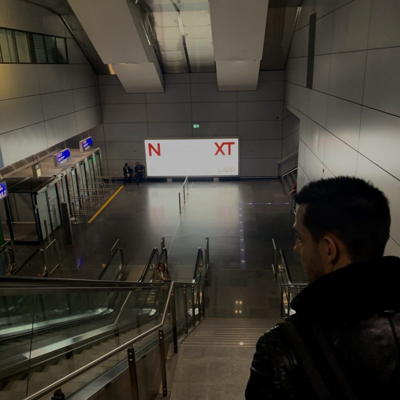
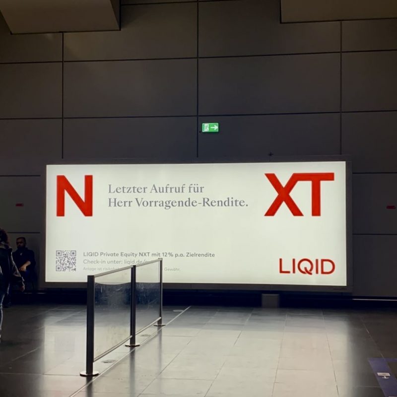
1. Make the brand impossible to miss
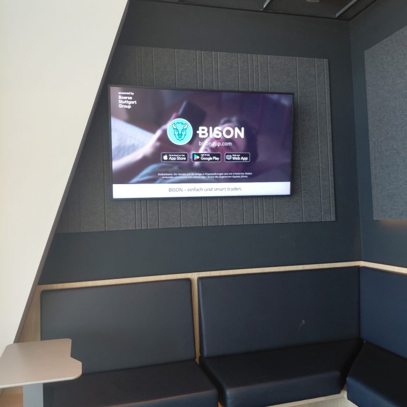
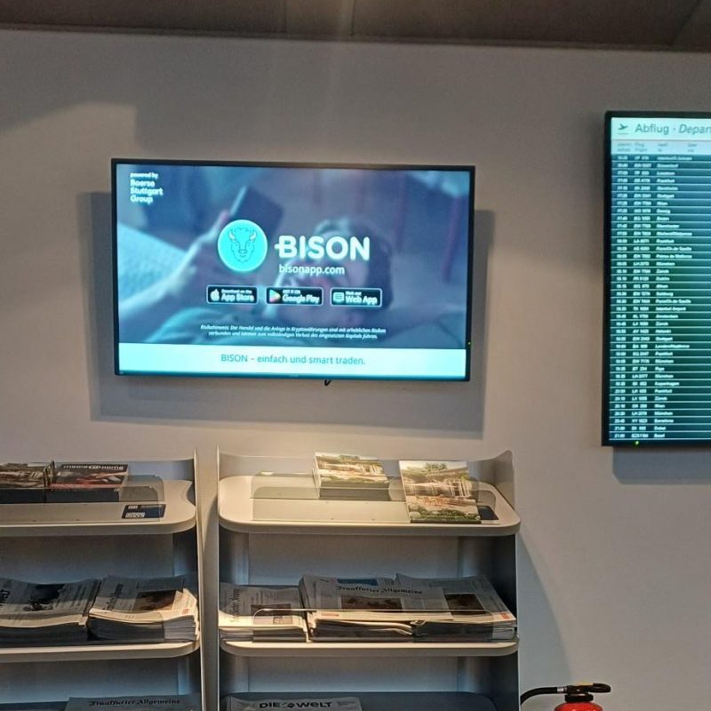
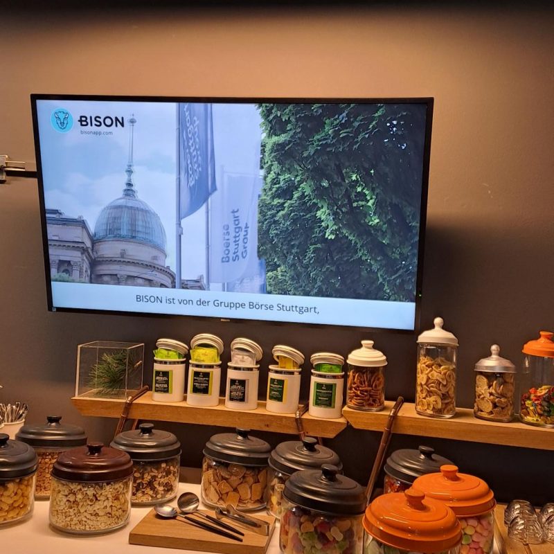
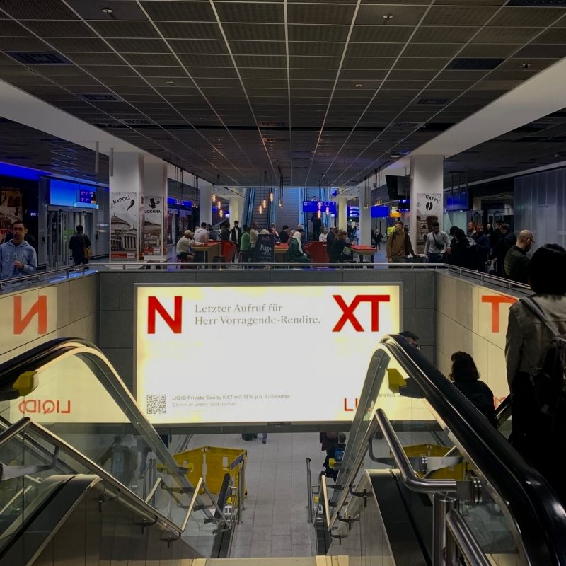
The single most common mistake in airport creative is a logo that’s too small or shown too late. It’s a problem we see across categories — banks, luxury, travel, tech, FMCG. The creative is beautiful, the model is striking, the scene is cinematic, and the brand is a whisper in the corner.
In a three-second glance, a small logo doesn’t transfer. The ad gets remembered. The brand doesn’t. That’s the worst possible outcome — you paid for awareness and built it for someone else.
Make the logo big. Place it where the eye naturally lands. If it feels too large to your design team, it’s probably about right for the environment.
2. Give the product a stage of its own
Faces draw attention. Products drive purchase intent. These are two different jobs, and one creative scene rarely does both well.
The fix isn’t to choose. It’s to properly plan for both — especially in digital airport formats where you have multiple scenes to work with. One scene built around the product with clear depiction, large text, strong contrast. Another scene built around the human element. The combination outperforms either alone, because each scene is doing the job it’s designed for.
In static formats where you only get one frame, the call is harder. Our default recommendation is to focus on product clarity. The face will help you get remembered, but if the viewer can’t tell what’s being sold, memorability becomes a nice to have.
3. Use faces — but don't let them run the ad
Faces and direct eye contact are the strongest single driver of memorability we’ve ever measured in OOH. A person gazing into the camera with visible emotion gets remembered at rates well above category average.
But faces also pull attention away from the product. The eye locks onto the face and stays there. So the rule is strategic use, not blanket use. Show the face when memorability is the goal. Show the product when communication is the goal. And in a campaign with multiple scenes, make sure both jobs get done.
One thing that gets underrated: the gaze itself matters. A face looking off-frame is decorative. A face looking at the viewer creates connection. Brief your creative team on this — it’s a small adjustment with disproportionate impact.
4. Win in the contrast, lose in the complexity
Airport environments are visually loud. Bright lights, signage, crowds, screens everywhere. Your creative is competing against all of it.
Two things help. First, contrast — bright backgrounds, strong color separation between product and background, large text. Anything that makes the ad pop out of the visual environment around it. We see attention scores rise sharply when contrast is high.
Second, simplicity. The temptation is to pack the frame with information — product shots, lifestyle elements, copy, claims, logos. It feels like more value per impression. It isn’t. In a three-second glance, a busy ad gets skipped because the brain can’t process it fast enough. A clean composition with one focal point, one message, and clear brand presence outperforms a cluttered one every time.
If you have to fight between adding an element and removing one, remove.
The shortcut
When we review airport creative with clients, we run it through four questions:
- Can you identify the brand in two seconds?
- Can you identify the product in two seconds?
- Is there a face or human element doing the memory work?
- Does the composition pop out of the environment, or sink into it?
If three out of four are yes, you have a campaign that will perform. If two or fewer, the creative is the bottleneck and NOT the placement, NOT the budget, NOT the booking strategy.
Airport OOH rewards discipline. Believe in the process.